Usability heuristics evaluation &
Redesign concept
Product Designer
Role
Team
Cecilia Cao
Marmara El Masri
Timeline
5 Day - Sprint
Tools
Figma
Walmart Inc. is an American multinational retail corporation that operates a chain of hypermarkets, discount department stores, and grocery stores. They find value in creating a seamless shopping experience, which includes a mobile ecommerce app to provide customers a way to save time and money.
Walmart
Values
Respect, service, excellence, and integrity
A heuristic evaluation is a method for finding usability problems in a user interface design. They involve having a small set of evaluators examine the interface and judge its compliance with recognized usability principles (the “heuristics”).
What is a Heuristics evaluation?
10 Usability Heuristics:
Severity Ratings for Heuristic Issues
Severity ratings can be used to allocate the most resources to fix the most serious problems and can also provide a rough estimate of the need for additional usability efforts.
These ratings are a combination of three factors: frequency, impact, and persistence of the problem. Based on the severity of the usability problem, a number is assigned to each evaluated heuristic, using a 0 to 4 rating scale.
The problem with the Walmart app was that users were left feeling confused about certain buttons and how to navigate, and were having a difficult time trying to find what they were looking for.
Users were left confused.
To gain a more genuine perspective of the problem, we placed ourselves and sample test users into the shoe of Walmart shoppers by going through a common experience - buying something!
User Journey
The goal here was to evaluate each screen our test-users came across when going through the user journey. With having them think aloud as much as possible, we were able to assess how their behavior reflected their interaction with the app, along with minute details.
After gaining insights from user-testing, we were able to set appropriate severity ratings based on the usability violations observed from each screen.
Tearing it down
Flexibility and efficiency of use
Aesthetic and minimalist design
Match between system and the real world
USABILITY VIOLATIONS
The home screen of any app is crucial for several reasons. Firstly, it’s usually the first point of interaction between the app and the user, thus having the most impactful chance on setting a good first-impression to entice users to explore further. Secondly, the home screen serves as a hub for navigating the app, so it should provide clear pathways to support the users in finding what they’re looking for. Finally, the home screen usually reflects the brand’s identity to reinforce its values and consistency for users. The above usability violations showed that the app’s home screen was not as effective as it should be, which is why it given a severity rating of 3 - a Major Problem.
Consistency and standards
Aesthetic and minimalist design
USABILITY VIOLATIONS
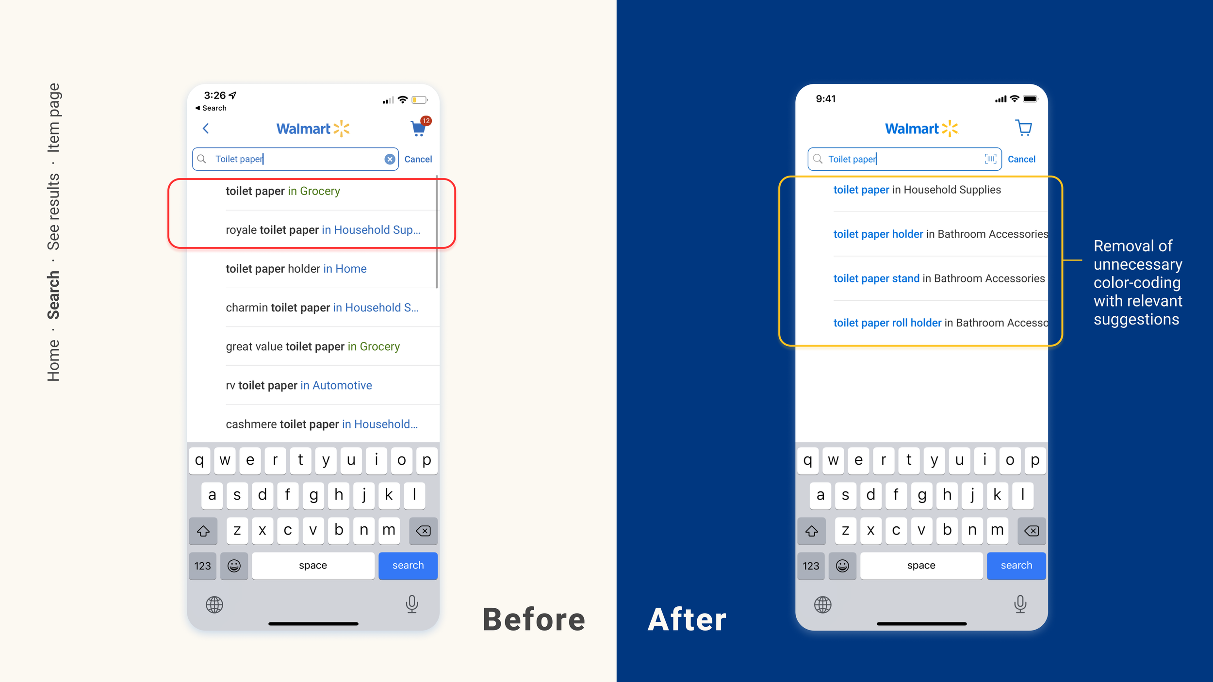
Consistency and Standards were violated on this screen in a way where different fonts were visually inconsistent. The aesthetic of this screen could have also been better as the use of whitespace gives off an imbalanced look. However, despite these violations, the screen does somewhat follow a familiar navigation structure for typical search functions on most apps, thus it was given a severity rating of 2 - a Minor Problem.
Aesthetic and minimalist design
Consistency and standards
Recognition rather than recall
USABILITY VIOLATIONS
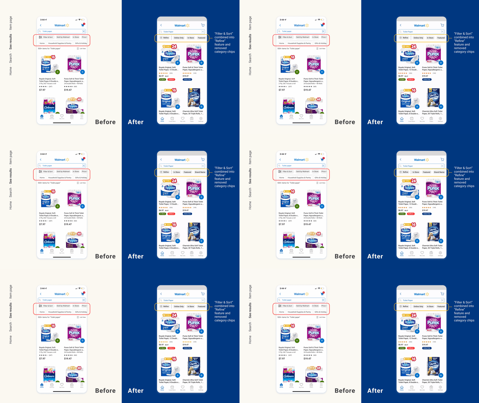
The filters and categories looked too similar with each other and there was no visual appeal as it lacked in contrast with the screen. Along with a lack of simplicity by avoiding to focus on the “Filter & Sort” button, gave an overall cluttered design. Furthermore, the add feature on each item were color coded, but there was no clarity on what the intention was behind it, making it very confusing for users to use and causes hesitation. This violation in Consistency and Standards, and Recognition Rather than Recall makes it harder for users to trust the shopping experience. A screen showing search results should be straight-forward so that users don’t spend too much time processing information, however, this screen does not follow suit, which is why it was given a severity rating of 4 - a Usability Catastrophe.
Aesthetic and minimalist design
Visibility of system status
USABILITY VIOLATIONS
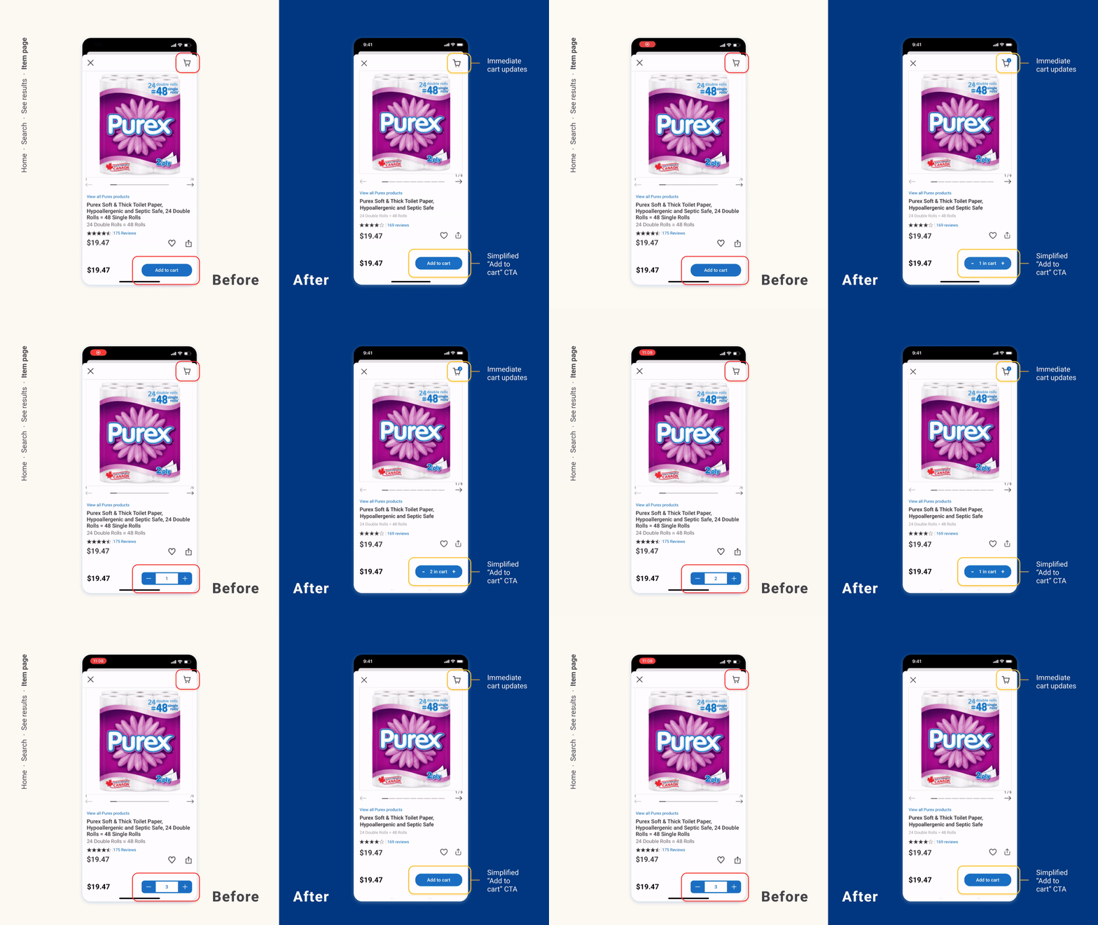
The redundant product name and details doesn’t follow suit with a minimalist design as it it wasting space, and can cause hesitation with users. Furthermore, the delay in adding the product to the cart after incrementing its quantity can cause users to become frustrated or assume that the app is unresponsive. Also, the cart will disregard quantity of a product, and instead, will only show the number of different products. This is a lack of feedback as it does not communicate what is expected from the user. Overall, since this screen is the main function of the user’s journey - to buy something - the violations observed is enough to have a severity rating of 3 - a Major Problem.
After the heuristic evaluation, it was time to redesign the screens. The focus here was not to change so much as to make the redesigns look separate from the original app, but instead, focus on each section that contained usability violations. This will help maintain the integrity of the brand throughout the app as intended, while improving the functionality for a better online shopping experience.


